You’ve heard the term “Responsive web design,” and have probably heard that it’s the biggest web design trend of the past few years. All the techno-geeks (including us) are telling you it is something your business can’t afford to ignore and is the secret of successful websites. But.. What is it exactly??
It used to be that when a website was designed, it was set for a certain screen size. Of course, computer screens would come in different sizes, but for the most part, they generally had a standard size, so traditional websites would display correctly on most screens.
Introduce the mobile device, with screens that are much smaller vs traditional computer screens. The first reaction to this was to start making alternate websites (or “mobile sites”) to fit on these small screens but considering that mobile devices now days come in many varieties; smartphones, iPads/tablets, netbooks, laptops, desktops, and more, it could be a bit overwhelming to create a separate “mobile site” for each screen size. Thankfully, there is another option, and it is called responsive web design. 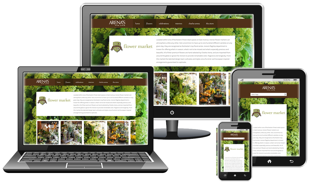
When a visitor comes to your website, the site will sense their screen’s viewing area and respond accordingly. Therefore with Responsive web design you only have to create, maintain and pay for one amazing website that can be viewed from any device.
There are new devices entering the market everyday, all with different screen sizes. Simply making one “mobile” version of your site for cell phone users is still not going to be suitable for every mobile device or even every mobile phone. With the rise in popularity of tablets, which have larger screens, but still not full size, you’d have to create multiple “mobile sites” to ensure adequate user experience for all of your website visitors.
Can you say that you only access the web through a computer screen? In 2015, not many people can. Responsive web design insures consistency across all screens, not just computers and cell phones. Here are a few basics on the concept.
Instead of designing based on a fixed area and filling in content and images, responsive design is developed on a fluid grid and based on percentages. It’s a much simpler way to ensure easy viewing on all devices. Since there’s no way to predict every width of every device your site will be viewed from, the fluid grid simply scales and reacts to the size of the screen. 
In other words, it automatically adjusts itself to the viewing screen, no matter the size. Think of water filling different shaped containers and adapting to each container’s shape. This is also helpful even for desktop browsers – if someone is viewing your site and their screen isn’t maximized or perhaps they have multiple windows open they’ll still be able to view the whole page without scrolling.
A best practice in responsive web design is to plan for the smallest screen your site will be viewed on, and start there. Perfect your website on the small scale, and then it’s easy to work your way up in sizes. Make sure your headers, links, pictures, etc. still remain clear and accessible, even on the smallest of devices.
No, we’re not talking about your PR department. Media queries are a way within the coding of your site that you can specify different ways for things to display on different screen sizes. For instance, if you only want a “Call now” button to exist on screens under 600 pixels wide, which is likely to be a mobile device, you simply set that in the coding of your site and it will not display on the desktop version unless the browser is resized.
It may be necessary to alter the way your website looks when it is smaller. You might want to hide some extra content, or remove an excess column to make it less crowded and easier to see. Again, CSS makes this easy to do. This is another good reason to start small, and ensure that the website is clear and organized on the smallest scale.
We hope you learned a little about why responsiveness is the future of efficient website design. As you might have guessed, it can be a pretty big thing to try and tackle on your own, but far too important to ignore. We can help you out with that – Just give us a call 863-687-0000 or click our “Get A Quote” button