
Company News & Announcements
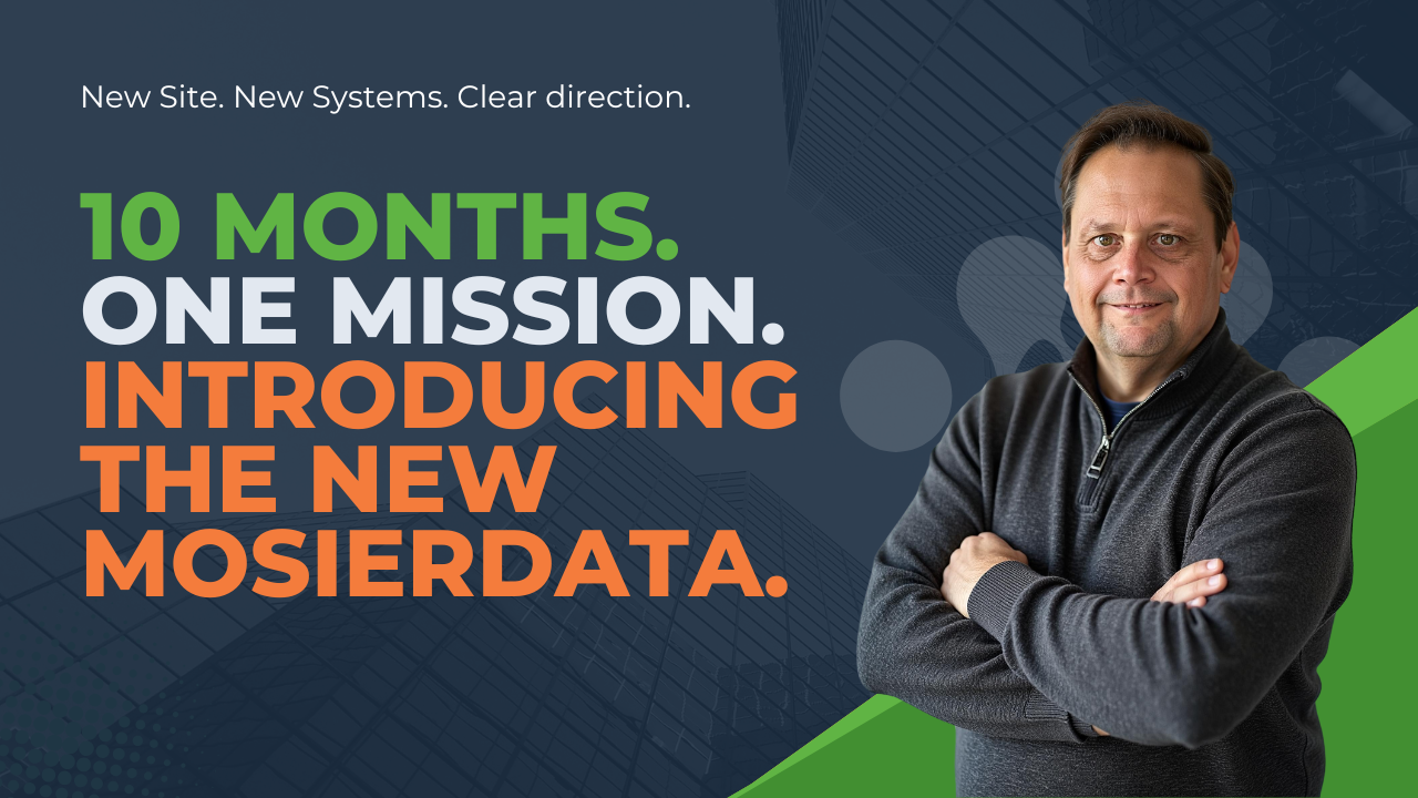
Welcome to the New MosierData: Clearer Systems, Deeper Purpose, Bigger Impact
After a full rebuild, MosierData returns with a clearer mission and smarter systems. Our new Smart Growth tiers—Find, Grow, Dominate, Evolve—aren’t packages. They’re proven frameworks for service businesses ready to scale with clarity, not chaos. From foundational SEO to AI-powered tools, every tier aligns with what matters: stewardship, simplicity, and outcomes that actually move the needle.